 This is the fourth blog post in our series on graphic design in letterhead.
For this post, we will be showcasing examples of design found in letterhead of press releases closer to home, from the Society as a whole, as well as releases from the Bronx Zoo and the New York Aquarium.
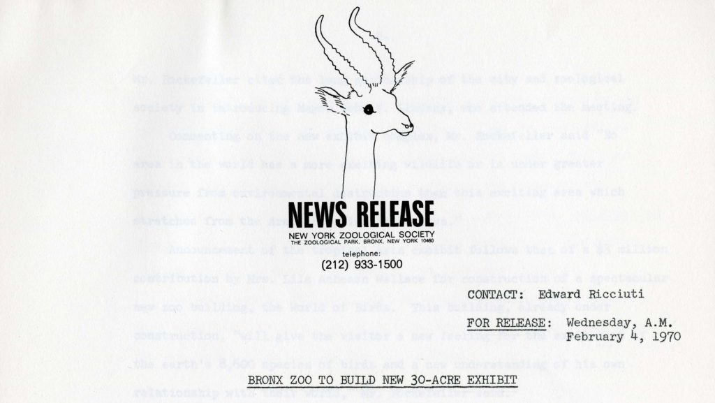
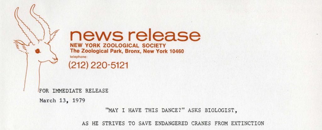
What is emerging from the examples below is a hint of the diversity present in the letterheads and stationery within the Society. Departments, facilities, research institutes and field stations would often have their own individual design (and a subsequent array of redesigns) which wasn’t always consistent with the overall brand and aesthetic conveyed in the Society’s letterhead–a plus for those of us graphically inclined.
1 a, b, c & d. New York Zoological Society, circa 1940s, and later from the 1960s and 1970s.
This design using the NYZS signatory ram’s head logo appears to have graced the printed page communicating Society information to the public during the 1940s.
This particular textually-based design seems to have remained constant, appearing in the Society’s press releases for the Society from the early 1940s up to the late 1960s. Interestingly, a variation of this design was used by Wildlife Conservation International, NYZS’s field program, including in their releases from the 1980s. Wildlife Conservation International changed its name from the Animal Research and Conservation Center in 1984.
Press releases for the Society shared an array of news to the public. Topics hitting the headlines included public admission rates, new exhibits, animal acquisition and breeding news from zoo and aquarium facilities. Releases also conveyed information on Society-wide activities including annual meetings, educational programs, announcements for upcoming Society publications such as Animal Kingdom, hosted talks and lectures, staff appointments, recognitions and obituaries, legislative campaigns, funding and budgetary news, and capital infrastructure projects.
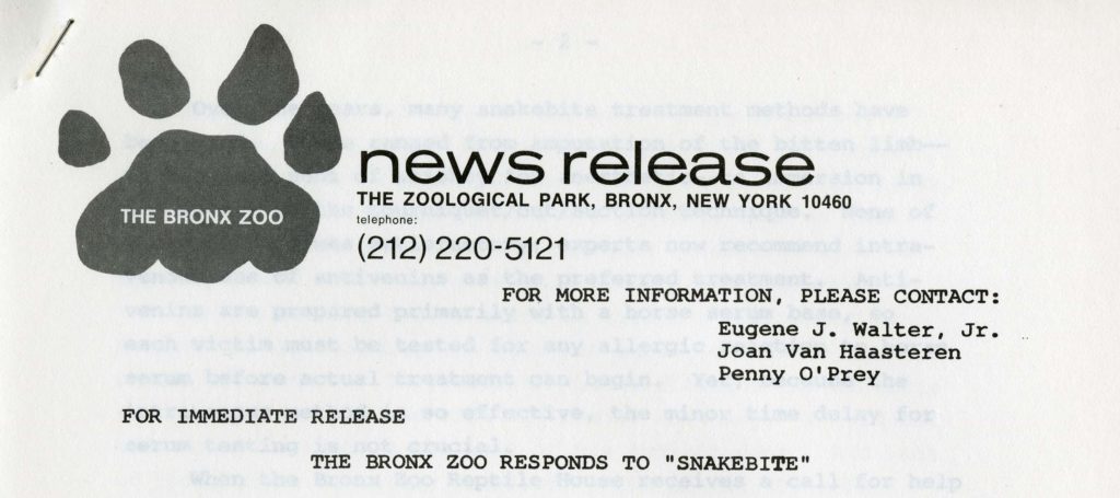
3 a & b. New York Zoological Park and Bronx Zoo, in the 1930s and three decades later, circa 1970s.
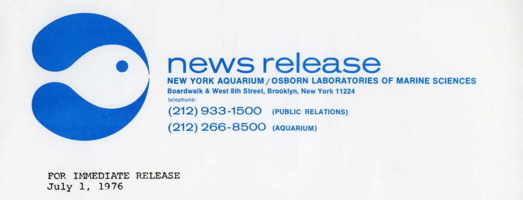
4 a & b. New York Aquarium
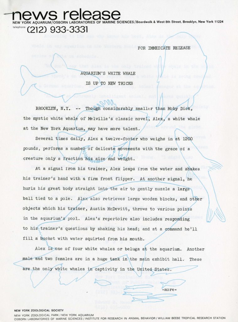
I find the letterhead from the New York Aquarium particularly creative. The 1971 example featured above uses line drawing and illustration (versus the primary use of logo and type) to convey a subtle sense of wonder and exploration. The letterhead is a simple type-based design, which I find leaves the reader to absorb the visual impact of the remainder of the printed page, as subtle as it is. The simple blue outline of fish in an assortment of sizes, shapes, and at varying angles gives the recipient of this press release the effect of peering into a world full of marine life.
This post was submitted by WCS’s National Historical Public Records Commission (NHPRC) Project Archivist, Emma Curtis.



It’s really interesting to see the changes in approach over the years. I, as well, particularly liked the Aquarium letterhead design from the 1970s!
Seeing these letterheads again reminded me of when I asked to comply a similar selection of letterheads and logos, as disparate as possible, for a (then) NYZS vendor working on an “identity project’ for the Society. That would have been in the early nineteen nineties. Thinking back on what these different letterheads mean, I recall that the Society maintained its in own in house printing shop until the nineteen sixties. The letterheads for different departments and divisions of the Society would have come from that single printing department, which also printed the labels used on exhibits at the Bronx Zoo. Different letterheads for NYZS executive staff, the Zoological Park, the Aquarium and the Tropical Research Department reflected a desire to identify the origin of a communication in an organization much more decentralized than at present.
Hi Steve,
Thank you for your comment and insight related to the graphic arts work conducted in-house. I’ve personally found it very rewarding in this project to have the opportunity to look at legacy design in letterhead. Also to spend time thinking about the long history of talented designers and artists who have contributed to NYZS throughout its history.